Friday, December 21, 2012

Versa's Holiday Favorites!

Holiday ads are at their best when they makes us feel all warm and fuzzy inside.  People pay special attention to ads at Christmas because everyone has a little spare time to look online for the perfect Christmas gift.

But some of the most effective Christmas advertisements aren’t for gifts, they’re for everyday home essentials, like shaving cream, coffee, tide bleach, and hair remover.  Those don’t seem like the most festive of holiday items, but by the time Christmas morning comes around, well, we’ve probably used at least one of them. 

Here are some holiday ads we’re especially impressed by: 

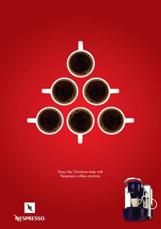
The Nespresso Coffee Machine.  It’s a simple design—6 coffee cups in the shape of a Christmas tree.  But there’s also an underlying message—doesn’t your entire family love coffee on Christmas morning?


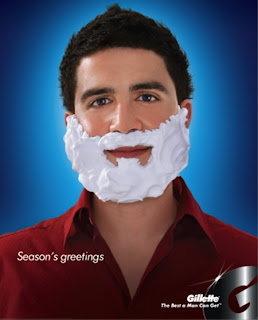
Did dad remember to shave?  Because otherwise he’s going to look like Santa Claus.   This clever ad from Gilette plays with the idea that dads don’t want to look too jolly.  At the same time, it reminds us of when we were kids and we couldn’t wait to steal our dad’s shaving cream to make our own frosty Christmas beard!


Who needs Tide bleach at Christmas?  Well, maybe someone will.  Tide’s Christmas tree tells us we should be prepared at all times.  What if we wear a not-so-adorable stain to our neighbor’s Christmas party? 


Veet helps women have soft, smooth legs without having to shave.  This ad recalls Charlie Brown’s bare little Christmas tree.  Who doesn’t love watching that movie every holiday season? 


Thursday, December 6, 2012


Brand Mantras:  Say What Everyone’s Thinking

Remember the “Got Milk?” ads of the 90s?  The ads were so popular that by the end of the decade, almost every famous celebrity had done a 1-page magazine insert with the then-iconic white mustache. 
Not everyone remembers the original commercial, either, but the phrase “Got Milk?” became a stock phrase in American culture.  So did “Hungry?  Why Wait?” Snickers’ popular ad campaign.  With the country’s move away from junk food and toward health food with no preservatives or additives, both ads went out of their way to make a new statement—when you have a craving, you have a craving.


Ads like these play into our work culture’s hunger for taking a break.  They provide a humorous mantra for the huddled masses, nudging you in the arm like a good friend who says, “You’re fine the way you are.”
Great advertising copy is about tuning in to who people really are and what they really want.  Snickers’ Joe Pesci “Hungry, Why Wait?” commercial is funny because it’s recognizable—two friends go out to a party, hoping to pick up some girls.  One of the friends is on edge (Joe Pesci):  “What are you looking at?  Oh, we’re not good enough for you,” he accuses a girl he’s just met.  His friend takes him aside:  “Eat a Snickers…Cause you get a little angry when you’re hungry.  Better?”  Magically, Joe Pesci turns into a normal guy in his mid-twenties, ready to act decently.


When done right, an iconic advertising phrase can bring people together.  They recognize themselves, their friends, and their friends’ friends in the advertisement.  And years after they’ve seen the commercial, they’ll remember that a Snickers or some milk is exactly what they need to curb the hunger they’ve had all day.  They don’t have to feel guilty about it, either.  


Tuesday, November 13, 2012

Smart Packaging


Just as you logo and name, the packaging you choose will also represent your business. That is what your customer will take home and that is the mental image your customer has of your product. Packaging is also very important for information. Unlike many other forms of information you might provide for your client, the information on the package will be actually read in most cases.

It’s important to have an attention-grabbing package that clearly displays your logo (and preferably tagline as well) and that embodies the aesthetic design of the brand. Innovation counts. You packaging can even be a form of advertising if done right.


Packaging must also be functional. It needs to send a message while still being the right shape and size for your costumers comfort.

This is another one of Versa Creative Group’s broad range of services. Besides branding and logo design we also acknowledge the importance of packaging. Here you have it all in one place. We know the importance of your business and how to help you climb to the top of your potential. 

Friday, November 9, 2012

Recent Designs: Logo Development


Logos are an essential part of your business. They are the “face” of your brand. They are the visual component of your company and should encompass and represent your brand identity. A logo appears in all you communication materials, in your marketing and advertising pieces. It must be simple and recognizable, but most importantly memorable so it may help with brand awareness.

At Versa Creative Group, we write the narrative and design the images that create a memorable impression in the minds of consumers. We are very proud of our logo design portfolio and wanted to share some of our recent ones.

We had a lot of fun designing all these logos and our clients are really happy! 

Tuesday, November 6, 2012

“What’s New Today, is Old Tomorrow”

Can we imagine living without a vacuum cleaner or without a refrigerator? Never, right? Well nowadays social media has become equally important is modern households. Can you imagine doing business without Facebook or Twitter? The answer is simple: not anymore.

There’s a campaign that has been capturing all advertising-related people’s attention as well as social media marketing enthusiasts. Moma’s Rodolfo Sampaio advertising agency in Brazil has come up with a brilliant thought-provoking campaign that is a memento of advertising back then, and these ads are recollection of the power of advertising and the innovation of technology.


These creative and eye-catching vintage ads have been running in newspapers to promote media seminars called Maximidia.

Sampaio said:

“Maximedia is an event intended for people working in communications. An updating event. Being that one of the greatest concerns these professionals have is to constantly reinvent themselves. What’s new today, is old tomorrow. With this in mind we’ve developed this campaign, showing how the tools in communication are quickly outdated.”

Friday, November 2, 2012

Is your Brand Bespoken for?

At Versa Creative Group we are proud to offer a broad range of services, including: website design and development, graphic design work for any marketing collateral, copy writing, marketing research, and social media strategy and implementation. We have the plan, information, creativity, and connections to optimize your brand's image and print and online presence.

Our wonderful team of graphic designers, copy writers, and web developers work hard on each task that crosses their desks (or in-boxes), whether the project is a logo design, a restaurant menu, a billboard, or simply a magnet. Because we have the privilege of working with such amazing brands, we are committed to ensuring that everything we create leaves a lasting impression and drives viewers/customers to your brand's website and/or store.

We have recently completed projects for 1919 Wine & Mixology, Tossini, and Rejenerated:


Each brand that we complete work for is like a person, with their own quirks, tastes, voices, and fingerprints. As such, we devote great attention to detail when it comes to market research, competitor analysis, audience targeting, logo development, website look, feel and functionality, website copy, and social media strategy. A great advertising campaign is memorable, consistent, and value-driven. We are more than an advertising firm, we are a creative firm that does more than just design, write, produce and animate. We listen. Is your brand ready to be bespoken for?

Monday, October 22, 2012

Teaching an Old Dog New Tricks: The Billboard


Billboard placement is one of the most traditional and oldest forms of advertising. With the advent of the digital age and the technological boom, creative advertising firms have had to teach this old dog new tricks in order to stay fresh and competitive. One way they have successfully achieved this has been through creative placement that utilizes space manipulation. When it comes to the three advertising examples below, the message is definitely a product of their environment -- culturally and literally.  

The billboard below (top left hand side) pops out from the building's facade and and breaks the visual plane as it emerges into the rest of the city's skyline space. If anything is a great attention grabber, it's definitely an optical illusion. The accompanying billboard on the right hand side takes advantage of a beautiful backdrop that naturally changes with the position of the sun. Late in the afternoon, the woman's hair glows gold. As sunset approaches, her skin and locks are rosily hued and when it is night, the image is the inverse of the day's cut-out. 


The power of the 3D billboard is not to be taken lightly, as demonstrated by the McDonald's series above. While it may not be everyone's first choice snack during the dead of winter, this little ice cream becomes the star of the winter-scape behind it. The 3D cone progressively grows as the snow piles up.

We would love if you shared unique billboards you remember with us on our Facebook page

Wednesday, October 10, 2012

A Very Versa Halloween

Halloween. Thanksgiving. Christmas. This trio hits the market fast and the market of social media advertising even faster. In order to stay neck and neck with competitors -- or lunge ahead -- we always make it a point to update our clients' Facebook cover photos according to the holidays. Below, we're showing off our most recent creations for Bel Furniture, Shany Cosmetics, and Smile Barn Dental. Our Creative Team, including our designers and copy writers, all have a hand when it comes to holiday brand vision. 

In our cover photo for Bel Furniture, we pair an ominous, yet elegant, chaise lounge with the light-hearted Jack o' Lanterns. "No Hocus Pocus." October is just a Bel Halloween with great savings and unique style. We can't wait to make a Thanksgiving themed cover photo for them!


Our wonderful client, Shany Cosmetics, boats a huge following on Facebook and as such, we have to make sure we generate fresh and trending content, including the cover photo. The "Treat Yourself" campaign corresponded to savings customers and fans enjoyed the week leading up to and the week of Halloween.


The spokes...animals of our client, Smile Barn Dental, get decked out for Trick or Treating in this Facebook cover photos. Bam Bam, Fluff, Daisy, and the rest of the furry crew appear frequently on the website's interior pages. The profile photo during the month of October was incorporated expertly into the larger image of the cover photo.


We would love to hear your feedback on our Halloween designs and would love even more if you stopped by our Facebook page and let us know your thoughts on our work. Happy Halloween!

Thursday, October 4, 2012

Dazzling & Elaborate Ads

The Versa Creative Team is always looking for inspiration and ideas. We often turn to the latest and greatest of wild advertising for innovative approaches to marketing. Ads that break the conventional and disrupt the routines of people's everyday lives stand out and dazzle us. The building signage below may be elaborate, but it literally spills its bold message into the space of the viewer and pedestrian. With the boom of digital and online advertising, it seems like a standard billboard or building sign needs to be doing much more than laying flat against a facade. We just hope that paint isn't still wet.   


An ad like the one below, with it's emphasis on copy and little use of color and image, may have a mere few seconds to engage the reader. The tone and clever use of the "M" cut-out does just that by posing a mini instructional guide to building lasting relationships. While not every reader is going to take the time to mentally cut out the "M" and rotate it until it becomes a "W," revealing the message of the ad, the ones who do may just visit the Stronger Marriage website. Our design team believes this ad would have been more effective had it utilized different typography and perhaps considered a more obvious approach to the message's hierarchy of content. 


An unexpected advertisement is always a hidden gem. Well, it's a least a hidden gem for people immersed in the creative advertising world. Nestle has its hands full against competitor, Mars Incorporated, and because of that, they kicked it up a notch with this bench advertisement for their ever-popular Kit Kat bar. The park bench, a tradition shared across many cultures, calls to the passerby with its bold, chocolate coloring. 


Like park benches, the public transportation system is also rife with advertising possibilities. Many firms opt for more than just a simple tagline or face to deliver their message. We think it's highly likely that a passenger disembarking from the bus below would certainly remember the boa constrictors coiled tightly around them. Word of mouth for the advertised zoo, no doubt, spread like wild fire.  


Friday, August 10, 2012

The World on Demand: Preparing for Generation “Screen”


Although Generation “S” may not be the official term for children born during the last three to five years, it is certainly catchy and reflective of one of the most exciting revolutions of the digital age.  Online advertising publications, blogs, and forums are abuzz with this phrase.  Generation “S” experiences the world differently from their “Echo Boomer” or “Generation Y” parents, who are no strangers to fast-paced technology either.  Generation “S” has been born into an era in which the “Screen” is King.  Virtually everything is accessible via the screen: shopping, entertainment, communication, education, and social interaction.  These smartphone and iPad savvy youngsters will have very specific expectations for marketers, retailers, publishers, and brands in the years to come.


How do today’s brands respond and prepare for these technological connoisseurs?  Generation “S” will want seamless transactions and communications.  The most important thing companies can do is create mobile-optimized websites.  The Interactive Advertising Bureau (IAB) has offers great ways to elevate a company’s digital presence for mobile users. http://www.iab.net/mobilecenter   By checking into the IAB’s Mobile Marketing Center of Excellence, companies can easily analyze their website’s mobile user experience and learn how to improve results.  The Marketing Center of Excellence also offers useful case studies and data points.

Additionally, companies should toss their hats into the burgeoning App arena.  With Apps, customers experience brands and contents in new interactive ways.  Many education companies have already started to do this.  Crayola ColorStudio, for example, has an App that allows children to “color” on their tablets.  The stylus used looks uncannily like a Crayola marker.  And, many museums today allow visitors access to Apps that correspond with featured exhibits.  Imagine accessing Houston’s Museum of Natural Science in the palm of your hand.  The possibilities for a Generation “S” screen-driven world are endless.

Tuesday, July 3, 2012

Versa + Cosmetics = A Gorgeous Partnership!


It’s been a crazy couple weeks in Versa-land! 

One of our clients, Shany Cosmetics, just came back from the IMATS (International Make Up Artists Trade Show) in Los Angeles and we obviously couldn’t let them show up there empty-handed. 


We created some pretty gorgeous banners for their booth, as well as brochures, packaging, and more. They blew everyone out of the water, if we do say so ourselves! 


Don’t just take our word for it though; here are some photos from the event so you can see for yourselves. 


The beauty gurus at Shany tell us they were slammed the whole two days. We like to think it was those awesome banners beckoning to them!


Friday, June 29, 2012


With the presidential race heating up, it’s only natural that ads are sure to follow; and we’re not just talking about campaign commercials! June has seen the presence of ads for two companies expressing some apparently polarizing political views.  Whether these brands and their marketing gurus meant to stir up some sentiment, both positive and negative, is unsure, but the result is still the same: people vowing to eat more Oreos or Denny’s and others calling for boycotts!

This Monday, Oreo posted a very symbolic-looking cookie on their Facebook page. Gone was the single layer of white crème bookended by two chocolate wafers; in its place stood six layers of colored filling, forming a rainbow. Underneath, there’s simply a date (June 25th) and a single word (pride). Considering the previous weekend saw many gay pride parades, people took it as a clear statement from Oreo (and their parent company Kraft). Their 26.9 million fans were split, some vowing to never eat Kraft again and some sharing supportive sentiments.

On the other end of the spectrum, Denny’s seems to be championing Americans’ second amendment right to bear arms. A family eating at Denny’s lists the reasons why America is so great. One of these reasons includes “our right to bear arms,” which, in turn, has some people up in arms over the validity of this statement. Just like Oreos’ pride pic, Denny’s fans have come out on either side of the debate.

Either way, both of these ads have people talking about the product…which is the point of advertising after all, isn’t it?